environmental design mmu
Friday, 20 January 2012
awesome ad campaign!
this ad campaign is awesome! i hope one day malaysia will create something cool like this!


Thursday, 19 January 2012
how are they related!
hello goodmorning sunshine!
today i dont really feel like writing:P but yeahh... i found an interesting video to sharewith u guys!
today i dont really feel like writing:P but yeahh... i found an interesting video to sharewith u guys!
texture
hey. :)
choosing a texture for any design is actually an important task!
texture helps to enhance the design... wether u want it to make ur design look futuristic,retro,modern and so many more.... texture give audience the ambience of u wanted it to be!


example of modern texture.


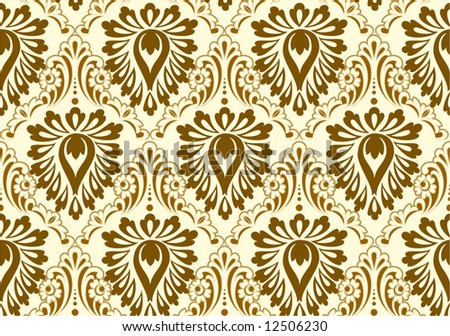
example of retro texture...
Hence, as a designer we cannot take easy during choosing a texture.!
choosing a texture for any design is actually an important task!
texture helps to enhance the design... wether u want it to make ur design look futuristic,retro,modern and so many more.... texture give audience the ambience of u wanted it to be!


example of modern texture.


example of retro texture...
Hence, as a designer we cannot take easy during choosing a texture.!
SIGNAGE
Do u guys know the the signage that we often see is also an environmental design? YES IT IS an environmental design. signage are use sometimes to tell ppl directions,brands, and so many more... here are some cool sign age that happened to captivated my eyes as a designer...


these cool signage is useful to attract user visitors client to enter their shop or their place to know what ever things they provide....
AWESOME eco friendly environmental design
Since this blog is all about environmental design(booth stage etc) i would to share my experience here... few month back i entered A competition named Istyle KLIA2011.. this year the theme is green runaway... during on the grand finale night im amazed with the stage... WHY? because it's all made from recycle item from the stage to the makeup table! the used item such as used box, use paper, old blocks of wood and so many more... i really do think THAT WAS AWESOME environmental design!


less is truly more.:)

i have been studying about grahic, multimedia for about 3 years and half so i do know a lil bit here and there about what is less is more concept of design... less is more design mean sometimes we doesnt have to put all of the idea of client or anything in a project... by doing this the design will look to cramp messy over crowd and so much more...
HOW TO CREATE A LESS IS MORE DESIGN? simple!
instead u cramp in all of ur idea in one design why cant or dont use something as metaphore to potrays ur idea? by this ppl will know what are u try to say or deliver...;)
by saying this not that more is bad. NO! some clients are very particular. sometimes they even want the design to be messy... but bein messy can be design as simple:D
thats all from me this time.. toddles..
xoxo
Subscribe to:
Posts (Atom)


