Friday, 20 January 2012
awesome ad campaign!
this ad campaign is awesome! i hope one day malaysia will create something cool like this!


Thursday, 19 January 2012
how are they related!
hello goodmorning sunshine!
today i dont really feel like writing:P but yeahh... i found an interesting video to sharewith u guys!
today i dont really feel like writing:P but yeahh... i found an interesting video to sharewith u guys!
texture
hey. :)
choosing a texture for any design is actually an important task!
texture helps to enhance the design... wether u want it to make ur design look futuristic,retro,modern and so many more.... texture give audience the ambience of u wanted it to be!


example of modern texture.


example of retro texture...
Hence, as a designer we cannot take easy during choosing a texture.!
choosing a texture for any design is actually an important task!
texture helps to enhance the design... wether u want it to make ur design look futuristic,retro,modern and so many more.... texture give audience the ambience of u wanted it to be!


example of modern texture.


example of retro texture...
Hence, as a designer we cannot take easy during choosing a texture.!
SIGNAGE
Do u guys know the the signage that we often see is also an environmental design? YES IT IS an environmental design. signage are use sometimes to tell ppl directions,brands, and so many more... here are some cool sign age that happened to captivated my eyes as a designer...


these cool signage is useful to attract user visitors client to enter their shop or their place to know what ever things they provide....
AWESOME eco friendly environmental design
Since this blog is all about environmental design(booth stage etc) i would to share my experience here... few month back i entered A competition named Istyle KLIA2011.. this year the theme is green runaway... during on the grand finale night im amazed with the stage... WHY? because it's all made from recycle item from the stage to the makeup table! the used item such as used box, use paper, old blocks of wood and so many more... i really do think THAT WAS AWESOME environmental design!


less is truly more.:)

i have been studying about grahic, multimedia for about 3 years and half so i do know a lil bit here and there about what is less is more concept of design... less is more design mean sometimes we doesnt have to put all of the idea of client or anything in a project... by doing this the design will look to cramp messy over crowd and so much more...
HOW TO CREATE A LESS IS MORE DESIGN? simple!
instead u cramp in all of ur idea in one design why cant or dont use something as metaphore to potrays ur idea? by this ppl will know what are u try to say or deliver...;)
by saying this not that more is bad. NO! some clients are very particular. sometimes they even want the design to be messy... but bein messy can be design as simple:D
thats all from me this time.. toddles..
xoxo
le modulor
here's is some facts that i know about the le modular after read and do some research on few articles about it.
The modular diagram was created,throughout the 1940's it was then devised and then developed by the same person name Le Corbusier.The reason Le Corbusier create the modulor is to scale a proportions which makes the bad difficult and the good easy. le modulor was actually developed from the leornardo davinci potrait that is virtuvian man. He creates le modulor by combining a number of seeming incompatible systems which is the metric system(cm,mm,m,etc) and imperial system(yard,feet,foot,etc). le modulor system is now been use to standardize all aspects of construction world wide!nowadays the plan,section and elevations,the roof and etc of a building are all carefully governed by these measurement as well as the furniture design and setting out the interiors...

The modular diagram was created,throughout the 1940's it was then devised and then developed by the same person name Le Corbusier.The reason Le Corbusier create the modulor is to scale a proportions which makes the bad difficult and the good easy. le modulor was actually developed from the leornardo davinci potrait that is virtuvian man. He creates le modulor by combining a number of seeming incompatible systems which is the metric system(cm,mm,m,etc) and imperial system(yard,feet,foot,etc). le modulor system is now been use to standardize all aspects of construction world wide!nowadays the plan,section and elevations,the roof and etc of a building are all carefully governed by these measurement as well as the furniture design and setting out the interiors...

the le modulor diagram that was created by lecorbusier
concept board+exhibition profile for SEED exhibition booth.
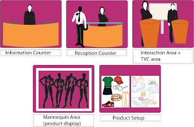
after the layout of exhibition booth was designed... zul and i have to create a concept board and also exhibition profile to achieve the vision of both ideas.For this task... zul and i have make a decision where we'll be use a "living on the runaway" as our theme.. MEANING? hermmm... our vision is like , when a visitor enter the exhibition are they'll feel like theyre model that walking on the runway... to achieve this vision our exhibition area will have my many mannequins that wear SEED product to be a metaphore like the maneequin is a model... as for the base there will be a slunt and look like a stage and covered by a white glossy tiles that can be seen on the real runaway...there'll be also many spotlight and also disco light to bring the mood to the visitors... for the exhibition profile... there'll be information counter, reception counter, interaction+tvc ad section, mannequin area and also product setup section
concept board
exhibition profile
plan layout
Saturday, 14 January 2012
what is artist impression?
in the previous assignment which is assignment 2... phase 2... zul and i faces some difficulties during doing artist impression... we both quite not clear about artist impresssion...after doing a lil bit research on artist impresion... based on what i understand... It is an idea on how the final product will look like when its complete... like the measurement of everything with a human figure include in it... well here are some example of what artist impression are...


Sunday, 1 January 2012
exhibition booth rough sketch!
here's the rough sketch that zul and made for our exhibition booth... after all the arguments fight punching each other bad words. hahaha kidding.. but yeahhh... here it is:)


Subscribe to:
Posts (Atom)


